-p-500.png)
A website can contain the information a customer needs and still make them work too hard to find it. In a small review of 20 West Yorkshire business homepages, we saw strong examples of clear positioning and proof alongside avoidable gaps in the route to enquiry.
These are credible potential conversion leaks in the visible customer journey: unclear actions and stale or broken routes can make it harder to enquire or buy. We did not have access to analytics or sales data, so we cannot put a number on their effect. The deliberately mixed local sample does not represent UK websites as a whole.

How we did the review
On 24 September 2026 we opened the homepages of 20 independently operated businesses with a West Yorkshire connection. The sample included eight furniture and interiors businesses, five accounting and legal firms, and seven plumbing or drainage businesses. We looked for four things a new visitor needs: what is offered, who or where it serves, credible reasons to trust it, and a practical next step. We followed a few visible routes to verify specific examples and captured the two screenshots below.
We chose a range of sites, not a random sample. Dynamic banners, device differences and later site changes may alter what visitors see. We did not turn this into a percentage league table because a limited public-page check cannot justify claims such as “X% are losing customers”. The 20-site sample register lists the exact URLs and sectors so you can inspect the same pages yourself.
Finding 1: A precise offer is a competitive advantage
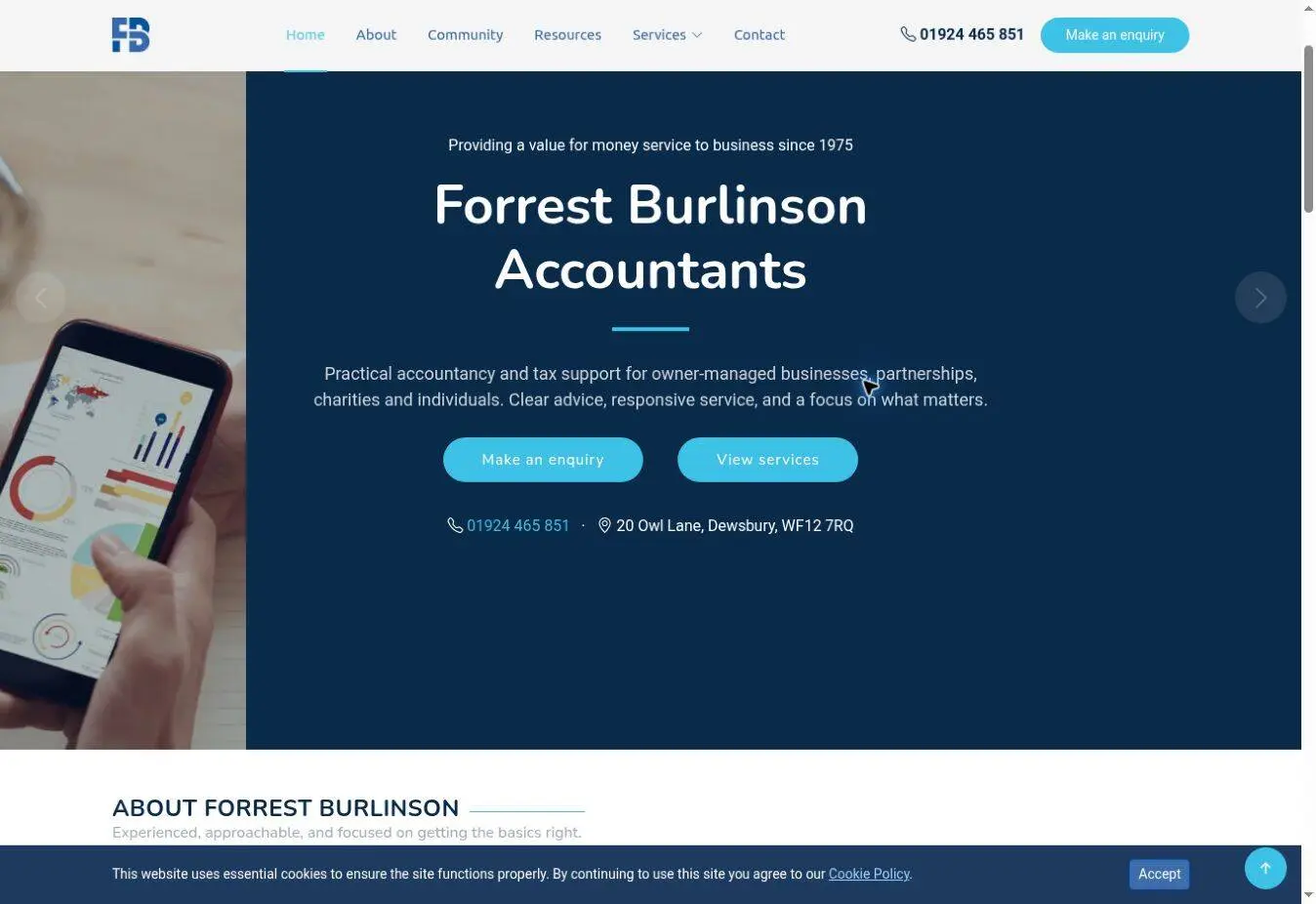
Forrest Burlinson describes accountancy and tax support for owner-managed businesses, partnerships, charities and individuals. “Make an enquiry” and “View services” are both visible near that explanation. A new visitor can tell whether the firm is relevant before committing to contact. The page also shows its Dewsbury location and long history. That combination does several jobs at once.
Contrast that with opening a homepage on which the first prominent line says only “quality” or “excellence”. Those words can support an offer, but they cannot replace the offer. ARC Accountants, for example, does eventually list self-assessment, tax, VAT and payroll services, while its opening uses a broader “accounting, business management, business consultation” description. The useful detail exists; it could do more work earlier.
Try this: rewrite the first sentence as “We help [specific customer] with [specific task] in [area or circumstance].” Then check it with someone who has never seen the business.
Finding 2: “Contact us” often hides a better promise
Several sites offer a useful outcome in the copy but label the primary button “Contact Us”. CPMS Plumbing explains an itemised quote and an 18-month workmanship guarantee, yet the prominent action is “Contact Us”. A button such as “Request an itemised quote” would tell a visitor what the click is for. The generic action is a likely point of avoidable hesitation: the useful outcome is hidden until the visitor reads further or clicks. Measuring its effect would require a test or enquiry data.
M&S Interiors gives a more useful model: it offers a free design and quotation service, shows indicative pricing and explains home visits. SOS Drainage leads with an emergency drain offer and a phone action. The right CTA depends on the job: “Call for urgent drainage help” and “Request a fitted wardrobe quote” answer different intentions.
Try this: write down exactly what happens after someone clicks your main button. Use that outcome in the label, then make sure the destination page delivers it. For more examples, see the seven jobs of a business website.
Finding 3: Old information can undermine a good offer
Wibsey Suite Centre communicates a Bradford furniture showroom, more than 40 years of experience and potential local delivery. But prominent copy near the top still refers to reopening on 15 June under government guidelines without a year. In September 2026 that reads as an old notice, and it competes with current buying information. In our browser check, the “Call us” link on the homepage led back to the homepage rather than opening a telephone dialler.
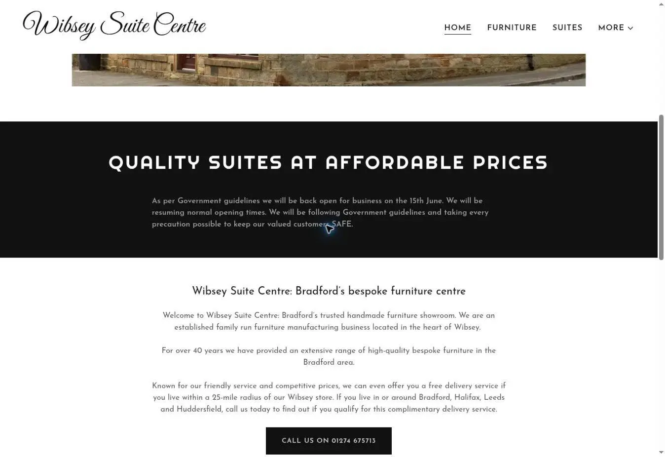
The expired-looking notice is a likely trust concern, while a call link that loops back to the homepage may directly interrupt an enquiry. We cannot size the impact from a public visit, but both are visible, fixable conversion risks. Set a calendar reminder for temporary banners and test phone, form and booking links after every site update.
Finding 4: Proof works best when it answers a buying doubt
The reviewed sites use different kinds of proof. Total Comfort explains showroom service, old-furniture disposal and customer reviews. JMB Corporate Law publishes recent transaction news and a named director. A&J Plumbing makes its Gas Safe registration number visible. Each is more useful than a generic “trusted by customers” claim because it answers a real concern for that service.
Try this: for each service, write down the customer’s biggest hesitation. Put the relevant proof near the action: a real project, a specific review, a qualification, a guarantee or practical terms. Do not make people open a separate “About” page to verify every important claim.
What we would change first on a typical site
- Write a one-sentence first-screen offer that names the customer and task.
- Replace an ambiguous primary CTA with the next action the visitor actually wants.
- Show proof beside the claim and remove expired notices.
- Test phone, enquiry and booking routes on a real mobile device.
- Review the relevant service or product page, not only the homepage.
- Measure qualified enquiries or orders before claiming that a change worked.
That order is a starting point, not an instruction to redesign every site. A company whose phone rings constantly may have a different bottleneck from one with plenty of visits and no enquiries. The public review identifies credible friction. Analytics and customer conversations help you rank it by actual impact.
Check your own site in five minutes
Open the homepage on your phone. Can a stranger say what you do, who it is for and where? Can they see what happens after the main click? Is the proof current? Can they reach a real person or complete the enquiry? If one answer is unclear, you have a useful first test.
Want us to review your actual journey? Request a free 10–15 minute website video review. Send the URL and we will show you three practical changes we would investigate first. It is a focused review of public pages, with no account access or sales call required.